Saturday, January 30, 2016

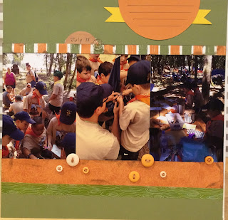
Scouting the oregon trail

Got another Cub page for you inspired by sketch #181 from Sketches in thyme
 
I used some super old close to my heart paper mixed with some brown scraps
 
 
I stuck pretty close to the sketch using buttons instead of circle punches. 

left side

right side
 
 
close up of the title.  I used the stamped  leather tag my son made on the layout to.


Friday, January 29, 2016

End of year celebration


Pack 52 end of year celebration was capped off with a water balloon toss and fight
 
Finally used up the streamer and confetti stickers from my first CM order 15yrs ago

kung hei fat choy


Kung hei fat choy= Happy New Year


Chinese New year was the theme for the Packs Blue and Gold banquet


I hand cut the Chinese characters for this page.  Time consuming but not too difficult to copy for the photo above
 

Sewing

One of the boys electives was sewing
My husband set up a sewing machine so that the boys could sew on a few patches.  They also got to practice hand sewing with a kit I built for them with cardstock covered cardboard buttons, embroidery floss and felt.
 

Tigers at News 16

tiger cubs on tour at News 16 KMTR
I used a patterned paper that kind of mimics the NBC peacock and made the middle strip with a newsprint paper to carry the NEWS theme

Pinewood Derby 2015

I didn't have a lot of photos from the Derby and had to rely on facebook downloads
I also didn't have a close up of my sons car thus the die cut police car.  
I created the border at the top of the page with a CM border maker punch (banner) and then added washi tape to get the checker board pattern like the flags in the photo

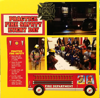
Fire safety

pack 52 was visited by Lane Rural Fire department for a special presentation on fire safety
 
I used the cardstock fire truck cut apart as embellishments for the page
as well as added the sticker the boys received.
 
In the photo of the boys and the fire fighter I had to do a little cut and paste.
 The boys were blurry in the photo with fireman and the one that was good really didn't have much of the fireman in it.  Think it turned out fine

Sleeping with the sharks

This two page spread was done on DCWV all about boys paper.  I took the color cues from the octopus on the paper and my son's jacket

The boys got to sleep in the viewing tunnels at the Oregon coast aquarium 

again the journaling is blank and awaiting my husband to finish the job.  I'm sure he'll get to it soon as I just finished the pages this past weekend at my retreat
 

more paper from all about boys.  I didn't want to cover up all the cool background print so I cut around som of the images and slid the paper under the jelly fish ( top right corner), the red fish ( top left) and the crab ( bottom left).  See below


The starfish photo and the fish are from those photo op boards that the kids can stick their heads through.  I didn't want the other kids in the photo and didn't have room for both the starfish and blue fish without cutting them out. Stuck them on pop dots for some added dimension


Scout awards pages

Some of these may look familiar as I featured them before as they are from the 1st scout awards Eric received as a Bobcat and Tiger
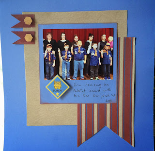
Eric's first Pack meeting and awards ceremony

 
receiving the Bobcat award
 
 
And then there are the new one
 
I took photos of the tiger belt loops to add to the page.
Eric earned the soccer and the other two were from Auston and Isaac
 
And here he is with his tiger strips all painted on.
 
I'm sharing this with lasting memories for their anything goes challenge as long as it fits the  "New Beginnings" the challenge is to show lasting memories what you do that's new. Activity, sport, project, hobby, making a new friend...
 

Camp Dakpta with Sketches in thyme

I'm finally getting back into the swing of scrapping.  I was fortunate to have had a weekend getaway at the Oregon 4-H center for a scrap retreat.  I put together this layout based on Sketches in thyme #182.  I changed the orientation of the sketch as well as added a photo instead of a journal box, but I think you can see the original plan in the final layout


I distressed the title by sanding my thicker sticker letters
 
The sign post is from a die cut set.  I used the matching frame as a photo mat instead of a frame so you could see more of the photo of my son on the climbing wall.  I also matted the sign post so that it would pop on the darker photos